NEW DESIGN PROJECT: THE SOUND WE SEE

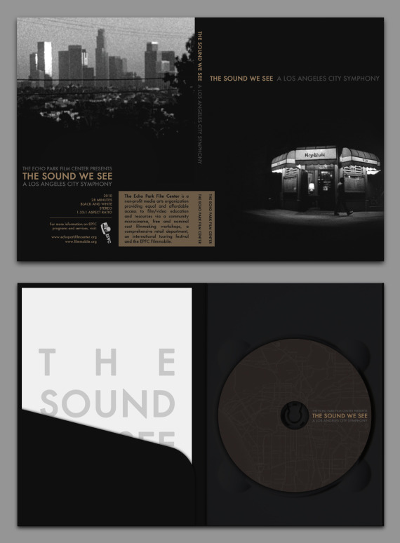
The Echo Park Film Center has just released the DVD for their excellent collaborative youth-made film The Sound We See: A Los Angeles City Symphony. I designed the DVD packaging, 6 page booklet, and menu.
Nicholas Monsour is an artist and film editor born and raised in Los Angeles.
The Echo Park Film Center has just released the DVD for their excellent collaborative youth-made film The Sound We See: A Los Angeles City Symphony. I designed the DVD packaging, 6 page booklet, and menu.
IAMPETH (the International Association of Master Penmen, Engrossers and Teachers of Handwriting), which describes itself as "an international, non-profit association dedicated to practicing and preserving the beautiful arts of calligraphy, engrossing and fine penmanship," has an absolutely wonderful, treasure-trove of a website at www.iampeth.com.
Highlights of the IAMPETH's website include the gallery of Master Penmen from the Golden Age of Ornamental Penmanship (replete with biographies and work samples), but by far the greatest thing this site has to offer is a PDF library of dozens of scanned, downloadable rare books filled with beautiful calligraphic designs.
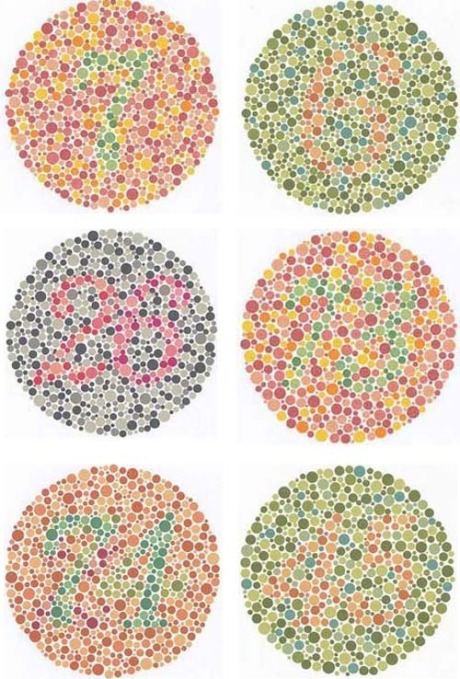
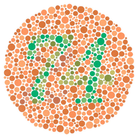
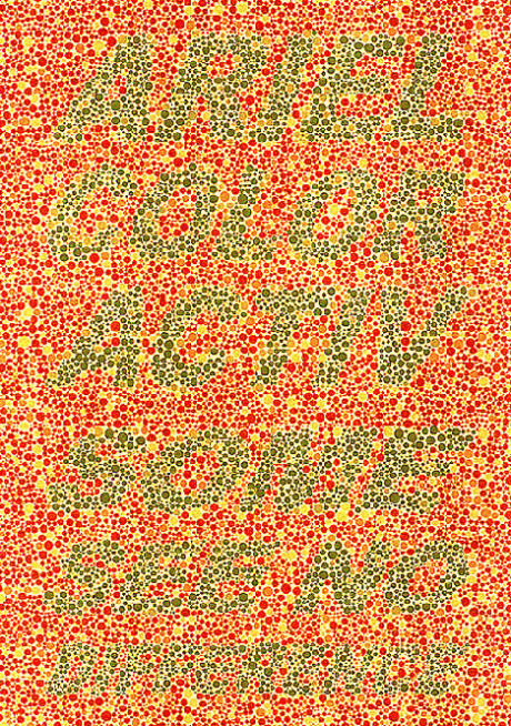
The Ishihara color test is a test for color blindness. It was named after its designer, Dr. Shinobu Ishihara (1879-1963), a professor at the University of Tokyo, who first published his tests in 1917. It makes use of the peculiarity that in red-green blindness, blue and yellow appear remarkably bright compared to red and green.
Here are some stunning images of the Seed Cathedral and UK Pavillion, designed by Thomas Heatherwick for the 2010 Shanghai World Expo.
Jeremy Geddes, The Cafe. Oil on Linen, 2008-2009.
Some of the more absurdly photorealistic paintings of Jeremy Geddes make me very uncomfortable because — I can only imagine — what I value most in painting and drawing is finding a unique synthesis of innovative technichal and conceptual methods. When I see images such s the one above however, the part of me that respects effort and craft, which has struggled with the hand/eye alchemy of representational skill, is very excited and dazzled — yet I do not feel that I have seen anything conceptually innovative. Regardless of this disappointment, Geddes' paintings are certainly worth marveling at, and I appreciate the consistent reminders from artists of this technical calibur of the thrill that extremely detailed and convincing handmade works can elicit — and the irreplacablility of the handmade is enough of a provisional concept for me, to indulge — even if it is only a connotation.
You can see more images of Jeremy Geddes paintings on his website, or in a zillion different magazines, or printed onto snowboards, etc.
Mur Island, by Acconci Studio, 2003. Graz, Austria.
Proposal for a New World Trade Center, by Acconci Studio, 2002.
House of Cars #2, by Vito Acconci, 1988.
I found this gem from the golden age of American Victoriana in a thrift store in Chicago. It is by one "Mrs. Julia M. Bradley", a psuedonym for the book's publisher, James B. Smiley — and the internet tells me it was referred to spitefully in the letters of Mark Twain (probably not this exact copy). The cover is by far the most interesting part, altough I keep it on hand should I ever be curious about such subjects as the "Treatment of Servants":
Train servants to answer the door-bell properly. Require them to treat all comers politely, and be careful to explain to them your rules about the 'not at home' formula.
or "The Ettiquette of Balls":
If a lady shows symptoms of weariness at any time, stop at once and escort her to a seat. No offence should be taken if a lady manifests a desire to stop at any time. If when escorted to a seat she releases the gentleman to find another partner, he should not accept the release.
Occasionally my habit of visually scanning sewers, gutters, abandonded lots and rubbish pays off with the discovery of something I've never seen before. In this case, the bright primary colors of these wrappers caught my eye, half-buried in a trash can on Hollywood Blvd. I am a huge fan of highly formal, presentaional and symmetrical graphic design, and I love these simple, whimsical and timeless images. I'm sure I wouldn't approve of the animal bi-products they once enclosed, but I find the packaging very satisfying.